The Power of Visual Design
As an instructional designer, you’re no stranger to the uphill battle of capturing your learners’ attention. In a world where people’s focus is becoming more and more fleeting, you’ve got to bring your A-game to keep them engaged and learning. Enter visual design.
Visual design in learning is all about strategically leveraging visual elements to elevate the delivery and comprehension of your educational content. From typography and colour schemes to images and infographics, every aspect of your visuals plays a crucial role in connecting with your audience and making your lessons stick.
Why Should You Care About Visual Design in Learning?
In the attention-deficit economy we live in, your learners’ eyes are constantly being pulled in a million different directions. According to Microsoft, the average human attention span has plummeted from a respectable 12 seconds back in 2000, to a measly 8 seconds in 2021 (Microsoft, 2015). That’s less than a goldfish, folks!
So, if you want your lessons to have a fighting chance of keeping your learners hooked, you’d better bring your visual A-game. But the benefits of visually-charged instructional design go way beyond just grabbing attention. When you strategically incorporate visual elements, you can:
1. Boost Engagement
Ditch the dry, text-heavy slides and give your learners something worth writing home about. Vibrant graphics, slick infographics, and captivating typography can turn even the most snooze-worthy topic into an immersive, can’t-look-away experience.
2. Improve Comprehension
Ever heard the saying, “A picture is worth a thousand words”? Well, it turns out the brain processes visual information 60,000 times faster than plain ol’ text (Stahl, 2013). Visual design gives you the power to transform complex concepts into easy-to-grasp visualisations that stick in your learners’ minds.
3. Enhance Retention
By creating a stronger connection between the content and the learner through visuals, you’re laying the groundwork for long-term knowledge retention. No more last-minute cram sessions before the big exam!
4. Cultivate Consistent Branding
Consistent visual branding across your instructional materials can help reinforce your organisation’s identity and create a cohesive, professional learning experience.
Practical Ways to Incorporate Visual Design
Alright, enough with the theory – let’s dive into the nitty-gritty of how you can weave visual design brilliance into your instructional materials. Get ready to be the Monet of learning design!
1. Meaningful Visuals
Ditch the stock photos and generic clip art. Instead, choose images, graphics, and icons that directly support and enhance your learning content. Every visual element should have a clear instructional purpose, not just exist for decoration.
2. Typography
Typography is the unsung hero of visual design. Play around with font styles, sizes, and spacing to create a visually appealing and easy-to-follow layout. Experiment with headings, subheadings, and body text to guide your learners’ eyes like a well-choreographed dance. Remember to keep accessibility in mind – the font needs to be legible!
3. Strategic Colour Schemes
Colour has the power to evoke emotions, highlight key information, and create a sense of visual flow. Develop a colour palette that aligns with your branding and learning objectives, and use it consistently throughout your instructional materials.
4. Infographics
Transform complex data and statistics into visually engaging infographics and charts. These visual representations can help learners quickly grasp and retain important information.
5. Interactivity
Bring your lessons to life with interactive elements, such as hotspots, animations, and gamification. These captivating features can turn passive learning into an active, engaging experience that your learners will remember long after the program’s end.
Real-World Examples of Visual Design Mastery
Still need some inspiration to get those creative juices flowing? Let’s take a look at a few real-world examples that showcase the power of visual design in learning:
Example 1: Instructional Design PLUS Course
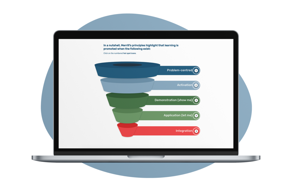
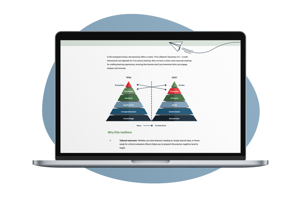
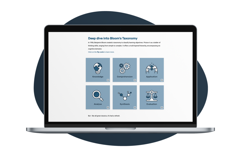
In our Instructional Design PLUS course, we use a clean, minimalist colour scheme with soothing shades of blue to convey a sense of trust and security. We incorporate sleek infographics to explain key theories and adult learning principles, and incorporate interactive scenarios that allow learners to practice applying the concepts in real-world situations.
Learn more about our Instructional Design PLUS course
Example 2: eCompliance Training
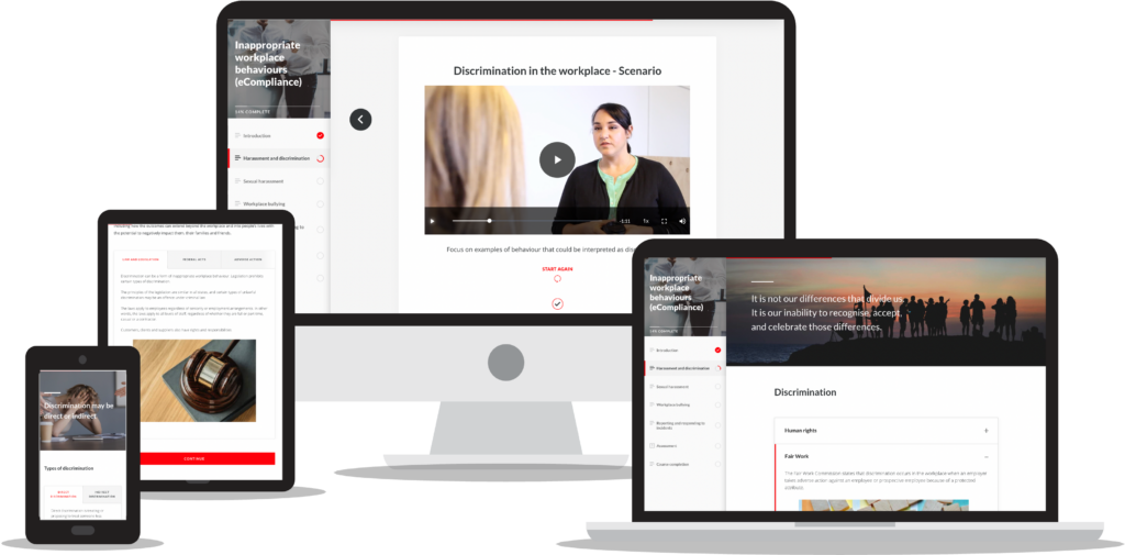
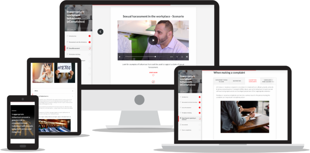
For our compliance training covering topics like workplace behaviour, OHS/WHS, privacy, and fraud prevention, we strategically applied visual design principles.
Clear, informative diagrams and illustrations were used to explain key policies, regulations, and procedures in an easy-to-understand way. To make the content more relatable and visually interesting, we incorporated authentic workplace photography. These images provided important context, while also helping learners connect the compliance requirements to real-life scenarios they may encounter.
To further ground the training in real-world applications, we filmed a series of video scenarios featuring actors playing the roles of managers, HR representatives, and employees. These videos depicted common workplace challenges and provided opportunities for learners to pause, reflect, and discuss how they would handle the situations. The visual authenticity of these videos, combined with the ability to apply the lessons learned, created a deeper level of understanding and retention.
The visual consistency and thoughtful use of visual elements helped reinforce the training’s professional, trustworthy branding.
By employing a strategic, multi-modal visual design approach – encompassing diagrams, photographs, animations, and videos – we were able to transform a traditionally dull compliance training into an engaging, impactful learning experience. Learners were captivated by the visual storytelling, which helped reinforce the importance of the subject matter and foster a true sense of understanding.
Learn more about eCompliance Training
 Example 3: Software Training
For a software training course, our team leveraged crisp screen captures and annotated diagrams to guide learners through the various features and functionalities of the application. We used a consistent typographic hierarchy and branded illustrations to create a cohesive visual identity throughout the course, making even the most complex software user-friendly.
Example 4: Leadership Development
In a leadership development program, the instructional designer used a bold, vibrant colour palette and dynamic illustrations to convey a sense of energy and empowerment. They incorporated storytelling elements, such as character-driven scenarios, to help learners connect leadership principles to real-world experiences.
Tips to Elevate Your Visual Design Game
As you become a visual design superstar, keep these tips in mind:
1. Prioritise Clarity and Simplicity
Resist the urge to go overboard with flashy visuals. Cluttered or overly complicated designs can distract and confuse your learners faster than a hummingbird on Red Bull. Stick to clean, uncluttered layouts that prioritize clarity and ease of understanding.
2. Ensure Accessibility
Make sure your visual design is accessible to all learners, including those with disabilities. This might include providing alt text for images, ensuring appropriate color contrast, and considering the unique needs of different cognitive and learning styles.
3. Continuously Iterate and Refine
Gather feedback from your learners and monitor their engagement levels. Use this data to refine and improve your visual design, ensuring that it continues to meet their needs and preferences. After all, what’s the point of creating a masterpiece if your learners can’t fully appreciate it?
4. Stay Ahead of the Curve
Keep an eye on the latest trends and best practices in visual design, and explore how you can incorporate them into your instructional materials. This will help you maintain a fresh, modern, and engaging learning experience that keeps your learners coming back for more.
Ready to Embrace the Power of Visual Design?
As instructional designers, we have the power to transform even the driest of topics into visually captivating, mind-expanding experiences.
If you want your lessons to have a fighting chance of keeping your learners hooked, you’d better bring your visual A-game. The benefits of visually-charged instructional design go way beyond just grabbing attention!
References:
Microsoft. (2015). Attention spans. https://about.ads.microsoft.com/en-us/insights/attention-spans
Stahl, S. (2013). The brain, cognition, and reading. The Science of Reading: A Handbook, 7-24.

